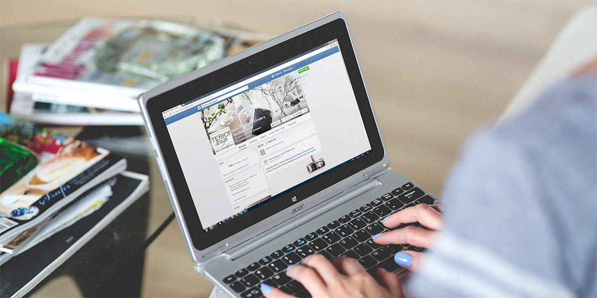
A new look for Facebook Pages is on the way, and has already begun appearing for most users. Notable changes include:
- Profile Image (logo) has moved to the left column, giving it more prominence on the page
- The Cover Image is now free from distractions, no longer obscured by the Profile Image. Page name and category, which used to be overlaid on the Cover Image, have also been moved.
- Page "tabs" are now links below the logo in the left column, allowing more links to be shown.
- Like, Message and Share Buttons have moved to the lower left side of the Cover Image.
- The Call To Action button is now larger and positioned to the right of the Like, Message, and Share buttons.
- Pages are now free of ads on the desktop. Ads previously appeared in the right column.
The new layout brings a clean and uncluttered look to pages, and most brands will welcome the more prominent logo placement and unobscured cover image. Still, if you maintain a Facebook Page for your business, you should check out how it looks with the new layout and make changes as needed - especially if your Cover and Profile image were cleverly designed to take advantage of the overlapping placement that no longer exists.


